

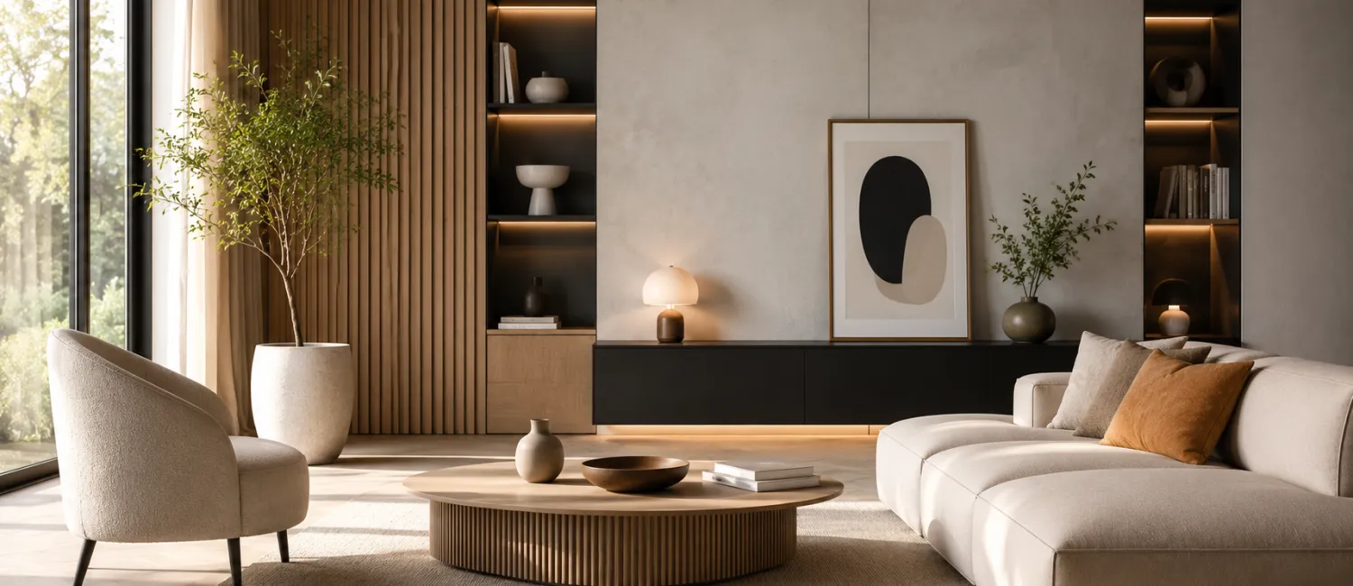
Spring metamorphosis: Choose the perfect color for your interior
 |
 |
Warm, sunny weather is a sign that the best time for spring interior painting has come. However, before we start working on a colorful metamorphosis, it is worth considering the choice of colors carefully: When choosing colors for your home, you should take into account not only fashion, but also the type of room, its style and proportions. The right color will have a positive impact on our well-being and make us more willing to stay in the comfort of our home. So let's keep in mind the importance of color psychology. Moreover, if the room has defects, e.g. inappropriate proportions, we can effectively mask them using wisely combined colors - explains Błażej Bierczyński, Bondex expert.
 |
An interior where you will feel good
When looking for colors for your apartment, it is best to focus on those that you simply like. However, we should remember that some of them can be very difficult to use - black or navy blue on the walls can make the interior look overwhelming. So which colors will be the most appropriate?
Colors can be easily divided into warm ones (such as reds, yellows or oranges) and cold colors (e.g. shades of blue, greens, grays). The first of them stimulate creativity and improve mood. The latter are conducive to relaxation and calm. However, each of them also has a unique effect - for example, red increases blood pressure and stimulates action (too much of it, however, can be tiring).
 |
Yellow, on the other hand, adds energy, making it perfect for rooms intended for work or study. Orange is the color of joy and improves mood, so it is recommended wherever people meet. Brown, on the other hand, brings a feeling of security and stability to the interior. Greens, classified as cool colors, have a similar effect and are famous for their soothing and calming character (so they are perfect for a living room where we can relax after a day full of work). Blue - especially in light shades - will bring a feeling of freshness and relaxation to the room. However, neutral grays and whites are colors that provide mental clarity and restore internal balance.
 |
Orange kitchen and beige bedroom
When choosing colors, pay attention to the function of the room and answer the question: will it be the center of family life or will we look for silence and relaxation there? Cheerful and warm colors - light yellows, reds and oranges - work well in living rooms and living rooms, where we spend most of our time and meet with family and friends. An interesting solution will also be calmer grays or whites combined with stronger, colorful accents. Similarly, in the kitchen it is best to use cheerful colors - orange is especially recommended, as it improves appetite, making it conducive to meals with family.
In turn, in the bedroom it is best to use a color that helps you calm down before going to sleep. The ideal choice will be beige, blue, light brown, subdued green or purple. These are cool colors that ensure peace and good rest. We should also choose cool and neutral colors for bathrooms. White, blue or gray will be just right. A huge selection of various colors can be found in the Super Wall paint palette by Bondex.
 |
The importance of light
The color is what everyone sees...? Not necessarily! The way we perceive colors is also greatly influenced by the light falling on the wall surfaces. Therefore, in practice, the same paint may look completely different in natural and artificial lighting. Strong lighting goes perfectly with dark, intense colors, emphasizing them at the same time. On the other hand, pastels look better in subdued light. Similarly, warm-colored walls need warm, incandescent lighting. In turn, cool colors will look good if we combine them with cold lighting (e.g. neon).
Test before painting
Sometimes, however, despite many hours spent on color cards, we have trouble making a decision and are plagued by doubts. Then a good solution turns out to be... a color tester. For example, the Bondex brand has prepared convenient sachets for its customers, containing 50 ml of the selected paint - just enough to paint a piece of wall. After drying, we can check how the color looks in different lighting. Thanks to this solution, the color we choose later will certainly not surprise us, and the final effect will be consistent with our dreams.