Warm brown for winter
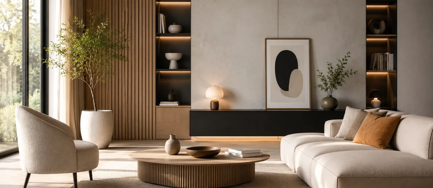
The advantages of bronze can hardly be overestimated. It is a color that gives a sense of security. It is not without reason that it is the most popular color of floors - when walking on them, we feel confident and stable. Most often we also surround ourselves with brown furniture and accessories. Why? Because it is brown that makes the interior seem cozy. In addition, it matches almost any other color - it is an ideal background for colorful curtains, carpets and decorations. It has only one disadvantage: it can be dark and then it is better not to use it in small rooms. But that's a good idea too. The smaller the room, the lighter shade of brown you need to choose. You can go from dark chocolate to coffee with milk - pastel shades of beige are the safest color in the interior.
Brown and its shades are colors that do not go out of fashion. This winter, enriched with shades from the " Colors of Nature " collection, they will make your home elegant. Here are safe sets for a cozy interior.
SET 1 - Earth colors
 |
Brown surrounded by its natural shades. Choose two dark shades of brown and combine them with delicate pastel creams. Additional colors? Gold, Copper, Yellow. If the set is too monotonous for you, but you do not like contrasts, paint the wall in stripes or stick wallpaper with brown patterns. Additives made of natural materials - wicker, wood, clay.
Basic color: 151 Desert flower
Complementary colors: 143 Castles in the sand, 102 Sandy beach
Contrast color: 122 Sunset
SET 2 - Streak of blue
 |
Brown and blue is a slightly old-fashioned set, but today returns to the past are very popular. If you want to stay in this climate, choose stylish accessories - carved frames, tin candlesticks. If you want to modernize the set, use shiny stainless steel and tinted glass. You can also add some purples: they will make the interior seem more refined.
Basic color: 143 Castles in the sand
Complementary colors: 141 Spring Rain, 146 Oriental Flower
Contrasting color: 155 Mountain crocus
SET 3 - Warm tones
 |
Brown belongs to a warm color palette, combine it with other warm colors: red, orange. You don't have to think long about the shade. Any shade of red works well with brown. Throw in some green for contrast, but only in little things. Leave the accessories in plain colors, you can play with the texture. Add soft and fluffy fabrics. Warm, so needed in winter.
Basic color: 151 Fragrant cinnamon
Complementary colours: 149 Memories of summer
Contrasting color: 124 Bouquet of roses
ATTENTION!
1. Too dark brown, in a small room it can look depressing. In such cases, always paint the ceiling white, it is good to leave at least one wall in a lighter shade.
2. A brown floor, brown furniture and brown walls are too much. Such a combination will always be monotonous.
3. If you paint all the walls brown, be careful with black accessories. Two very dark colors, especially on large surfaces, will not look good.