Stylish monochromatism or an invigorating play of colors?
Monochromatic interiors hypnotize with their stylish depth and noble design, while expressive color combinations delight with the energy flowing from the colors. No wonder there is no shortage of enthusiasts of both arrangement conventions. Which one to choose when arranging your own home depends only on the desired end result.
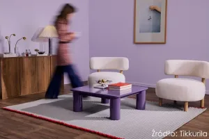
 photo: Tikkurila
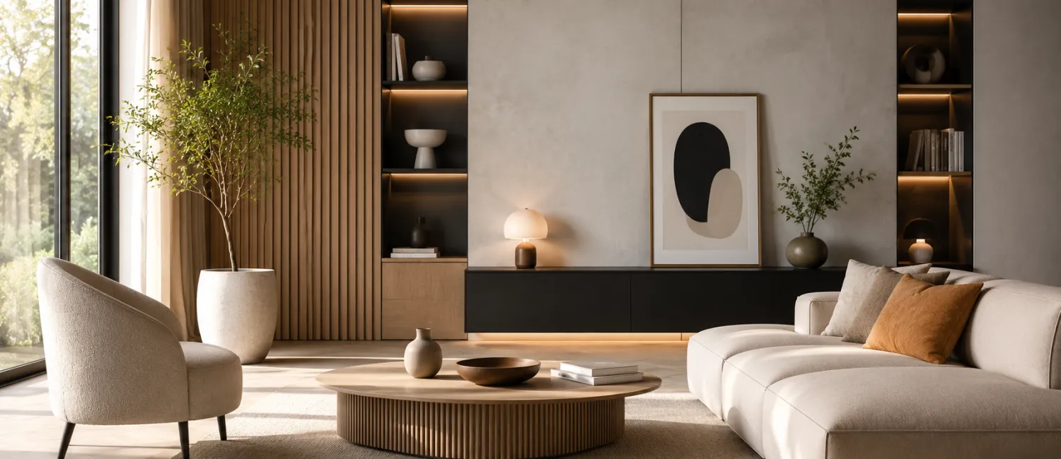
Monochromatic arrangements are dominated by elegance and a modern style. One shade used on various design elements makes the bedroom gain incredible intensity and charm. The J438 color wall from the Tikkurila Optiva Nature 5 palette tastefully matches the soft fabrics in similar tones that line the bed, making the interior seem light and extremely cozy.
Monochromatic decor does not mean colorless boredom. Just choose a slightly bolder shade of paint, such as K396 Safari from Tikkurila. Painting the walls and wooden furniture in the same expressive color will provide an absolutely spectacular effect. Accessories in matching honey tones will enhance the impression of sophisticated elegance and style.
If, despite the advantages of tone-on-tone decor, we prefer compositions that are more diverse in color, a contrasting tandem is the answer to all arrangement dilemmas. The combination of ruby red L418 of Tikkurila Optiva Matt 5 paint with discreet gray will surprise with its exciting freshness and expression. This version of the wardrobe will gain a distinct character, creating a colorful styling that no interior design enthusiast would be ashamed of.
A refreshing contrast in interiors can also be successfully introduced through details. Colorful furnishings and accessories in shades of ocher, cinnamon or mustard will add a pinch of tasteful spice to any arrangement. To maintain decorative balance, it is worth painting the walls in less flashy tones. The optimal solution will be, for example, matte gray L478 from the Tikkurila Optiva Nature collection, which will create a subtle, toning background for more saturated colors.